
Overview
The goal is to build a template displaying a social media post, that will have the following features:
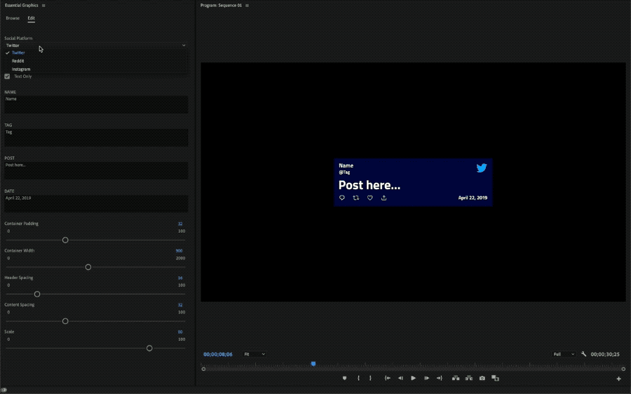
Reusability: Setup control shortcuts for changing post contents via the Essential Graphics panel - in both After Effects and Premiere Pro.
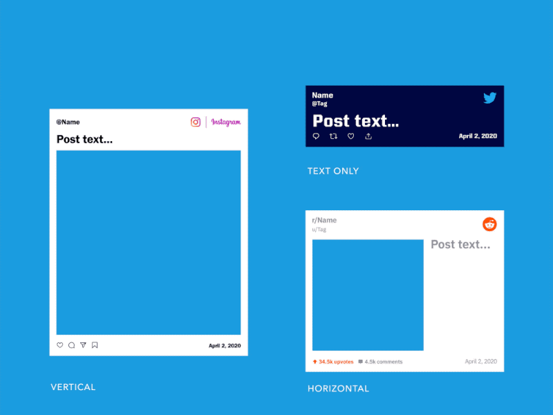
Post Style: Style the post for Instagram, Reddit, and Twitter, and allow quick switching between each interface via a dropdown menu control.
Responsiveness: Using expressions, we'll setup the post contents to be responsive to the size of their container. So by adjusting the size of the container, the contents will automatically reposition to fit the available space.
Post Type: Add a checkbox control to switch between an image post, or a text-only post.
Resolution: Setup the template for both vertical (portrait), and horizontal (landscape) display modes. Add a checkbox control to switch between the two modes. We'll use expressions to have the content automatically adjust.
To follow along, download the After Effects project file .aep from our Github page.
 gfxhacks
Note: You will also find the MOGRT template available and ready to use for Premiere Pro. If you are unfamiliar with MOGRT templates here is a quick introduction from Adobe.
Note: The After Effects project requires AE 2020 (17.0) or above - due to the Dropdown Menu control effect.
Note: If you get any expression errors when you open the project, make sure the Expression Engine is set to Javascript in Project Settings > Expressions or CMD/CTRL SHIFT ALT/OPT K. This allows us to use some of the newer Javascript methods available. More info here: Syntax differences between the JavaScript and Legacy ExtendScript expression engines.
Understanding the Rig
Let's jump right in. We recommend having the AE project open to follow along.
At it's core, the rig has a dropdown menu control that toggles between 3 different social media styles: Twitter, Instagram, and Reddit. The fonts, colors, and content (logo, icons), all swap accordingly to match the selected style - via the opacity property of each layer.
You can find the dropdown menu in the CONTROLS layer, named Social Platform - along with all the other controls for the rig. Those other controls allow us to alter the spacing between components, change the orientation of the post, or toggle between an image or text only post. Below is an animation showing some of these controls in action.
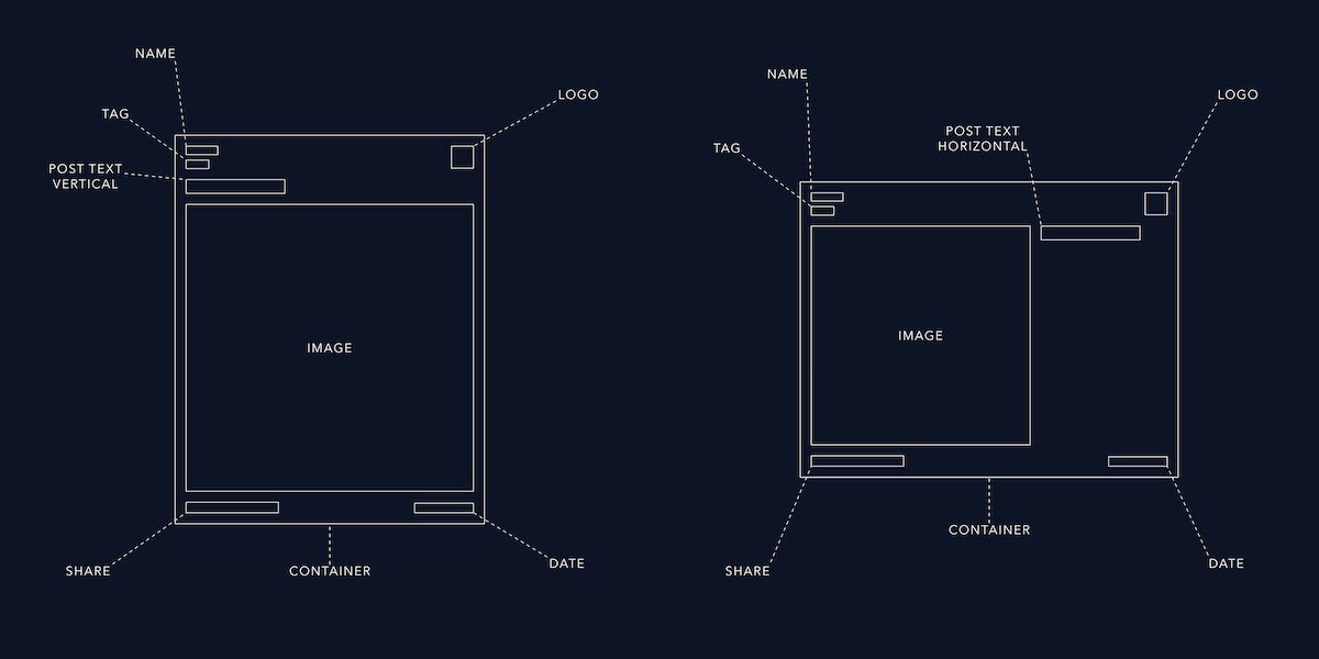
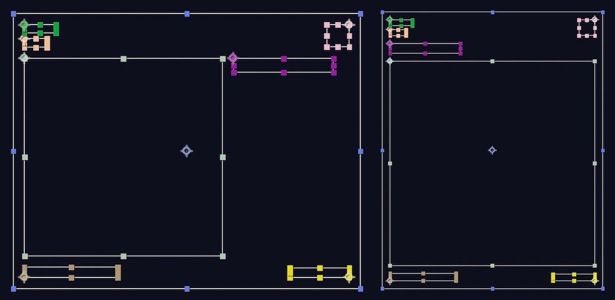
Here is a wireframe depicting the components that make up the social media post. We'll refer specifically to those across this walkthrough:
Note: Since most of the expressions are repeated for each component, we'll focus on the concepts and some of the exceptions. For more depth, simply look inside the project - we've added comments to each expression to help you navigate through. If you have further questions, get in touch! - // a comment looks like this.
Let's break down this rig by layer properties...
Position and Anchor Point
To setup the responsiveness of the rig, each element is parented to the CONTAINER. This way, when the container resizes, each element will maintain the same relative position to it.
Below is a reference to the resulting positions and anchor points once the expressions are applied, for each component.
If you open the After Effets Project and take a look at the position expression for the NAME layer, as an example, you'll see the reference to the CONTAINER layer - by using the parent property. You'll notice we are using the sourceRectAtTime() method to retrieve the width of the CONTAINER, and dividing that by 2; reason is, the anchor point of the CONTAINER is at its center. Since we parented the NAME layer to the CONTAINER, the [0,0] point of the NAME's layer position matches the CONTAINER's anchor point. So, to position the NAME layer at the left boundary of the CONTAINER, we subtract half of the container width. We can do the same with the height, so the resulting position of the NAME layer will be in the upper left corner of the CONTAINER.
We are then adding the padding value as specified in the CONTROLS and, in the case for the x value, we are also adding the current x position of the layer: value[0]. This allows us to manually offset the layer so we can fine-tune its position.
Here is a reference to the position expression for the NAME layer:
// get LEFT margin of container, add padding, add custom offset
x = -parent.sourceRectAtTime().width/2 + container_padding + value[0];

// get TOP margin of container, add padding
y = -parent.sourceRectAtTime().height/2 + container_padding;
When altering a layer's properties, its anchor point may shift. This happens if the layer's contents have their own transform; this is the case for text or shape layers. Often noticeable when adjusting the font properties or changing paragraph alignment for a text layer - and the text appears to change position. To avoid this behavior we can constrain the anchor point of a layer to its contents - defined by the content bounding box. We can use the sourceRectAtTime() method to calculate the actual dimensions of the contents and set the anchor point accordingly. Here are a few examples to constrain a layer's anchor point to different locations within the layer's boundaries. Those expressions go into the Anchor Point property of a layer, and requires 2 values: [x, y].
// [LEFT, TOP]
l = thisLayer.sourceRectAtTime();
[l.left + l.width/2, l.top + l.height/2];

// [RIGHT, BOTTOM]
l = thisLayer.sourceRectAtTime();
[l.left + l.width/2, l.top + l.height/2];

// [CENTER, CENTER]
l = thisLayer.sourceRectAtTime();
[l.left + l.width/2, l.top + l.height/2];Note: For a more in depth explanation of the sourceRectAtTime() method and usage, refer to: GFX Hacks: Anchor Point Expressions.
With the position and anchor point expressions in place, and the correct parenting, the NAME layer will always be constrained to the upper left corner of the CONTAINER.
Now, on the vertical opposite, are the SHARE icons. Those are precomposed and the precomp is again parented to the CONTAINER, but constrained to the bottom left corner of it instead.
Note: When working with precomps, the sourceRectAtTime() method returns the actual size of the composition. If you need to reference the size of a layer within a precomp, you'll need to reference the composition first, followed by that layer: comp('myComp').layer('myLayer'), instead of thisComp.layer('myComp').
You may notice the other elements are positioned accordingly and constrained to the corner nearest to them.
The exceptions are the TAG, POST TEXTs, and IMAGE layers; those depend on the item above them for their vertical positioning. So the TAG's y position, for instance, is calculated by adding: the NAME's y position and height, and the Header Spacing - as specified in the CONTROLS. The Header Spacing defines the spacing between the Header and Sub-header (in this case NAME and TAG). This setup allows for the NAME text to resize while the TAG keeps the same relative position to it. Try to change the font size or the scale of the NAME layer.
Note: The sourceRectAtTime() method retrieves the size of a layer in pixels but does not account for its scale. To calculate the final layer size we need to multiply the sourceRectAtTime() result by the layer's scale: layer.sourceRectAtTime().height * layer.scale[1]/100; - and make sure to convert the percentage used for the scale property to a decimal, by dividing by 100.
The IMAGE is also dependent on the item above it but, depending on the orientation selected, that item may be the POST TEXT or the TAG - since the POST TEXT is arranged to the right of the IMAGE in Horizontal mode. To handle this, we can use a simple Conditional Statement or rather, a Shorthand Conditional Statement: a shorter way of writing a conditional statement, using Conditional Ternary Operators. IF the Orientation is set to Horizontal, calculate the height and position of the TAG, ELSE calculate the height and position of the POST TEXT.
Here is a comparison of the two conditional statements that give us the same result, with the shorthand being more concise.
if(container_orientation === 1){
  l = thisComp.layer("POST - VERT");
}else{
  l = thisComp.layer("TAG");
}
l = (container_orientation === 1) ? thisComp.layer("POST - VERT") : thisComp.layer("TAG");
We have a brief explanation of Conditional Statements with examples here: AE Rig Series: Countdown Timer.
Opacity
This is where we control the visibility of a layer. Depending on the social media type selected in the dropdown menu control, some components may hide or show.
Once again with the power of Shorthand Conditional Statements we can add a single line expression to control the opacity property; that will set its value to 100 or 0, based on whether the statement returns true or false.
Below is an example for the Twitter logo - if Twitter is selected in the dropdown, set opacity to 100 (show), else 0 (hide).
// show if selected social is: Twitter
thisComp.layer("CONTROLS").effect("Social Platform")("Menu") == 1 ? 100 : 0;
Note: As of the current After Effects release (17.6), we can only retrieve the index of a dropdown menu control item. So in our case, where we have three values in the dropdown: Twitter, Reddit, and Instagram, their respective indexes are 1, 2, and 3; and are dependent on their predefined order. You can read more about dropdown controls and how to use them on the Create Dropdowns Using Expressions Adobe help page.
Container size
As we've seen in the Position and Anchor Point chapter, the component's positions are based on the size of the CONTAINER, but also constrained to the position of it - when the CONTAINER is moved, the components move with it. In practice, only the width of the CONTAINER can be adjusted manually via the CONTROLS; the height is calculated automatically based on the size of each vertically stacked component, and their specified spacing and padding (defined in the CONTROLS).
The size of the CONTAINER is controlled by the expression added to the size property of the Rectangle Path.
Towards the bottom of the expression, you will find the two lines that set the x and y values - those define the size of the CONTAINER:
x = container_width;
y = container_padding + header_height + (text_only ? 0 : body_height) + footer_height + total_spacing + container_padding;
As mentioned earlier, the width (x) is set manually in the CONTROLS, so container_width is in fact referencing the Container Width slider control, directly.
For the height, you'll notice we've separated the components by section, into three categories:
- HEADER: NAME, TAG, POST - VERT
- BODY: IMAGE
- FOOTER: DATE, SHARE
This helps us to consolidate the logic by giving structure to the components we need to work with, and allows us to write more concise code while saving us some time and clutter.
In essence, we would need to calculate the height of 6 items. We could reference the items one by one and calculate their height:
item1 = thisComp.layer(layer1).sourceRectAtTime().height * thisComp.layer(layer1).scale[1]/100
item2 = thisComp.layer(layer2).sourceRectAtTime().height * thisComp.layer(layer2).scale[1]/100
item3 = thisComp.layer(layer3).sourceRectAtTime().height * thisComp.layer(layer3).scale[1]/100
item4 = thisComp.layer(layer4).sourceRectAtTime().height * thisComp.layer(layer4).scale[1]/100
item5 = thisComp.layer(layer5).sourceRectAtTime().height * thisComp.layer(layer5).scale[1]/100
item6 = thisComp.layer(layer6).sourceRectAtTime().height * thisComp.layer(layer6).scale[1]/100
...then add the values up:
total_height = item1 + item2 + item3 + item4 + item5 + item6
or we could use a cleaner and more concise way, by defining the height equation in a Function, like this:
calculate_height = item => thisComp.layer(item).sourceRectAtTime().height * thisComp.layer(item).scale[1]/100;
and call it anywhere in the expression code to calculate the height of a specified layer:
date_height = calculate_height('DATE');
Note: In the template, we are actually declaring this function with a shorter syntax - known as an Arrow Function. Aside from the functional differences, we are using it solely for the more concise syntax.
With a function in place, we can do some more cool stuff while leveraging the power of Arrays (a list of items).
For the HEADER section, we placed each component in an Array:
header_items = ['NAME', 'TAG', 'POST - VERT'];
We then used the pop() method to remove the POST - VERT from the list if text_only is unchecked (false), and the orientation is set to Horizontal.
Note: The pop() method removes the last item in the Array. You can use the shift() method to remove the first item instead.
if(container_orientation !== 1 && !text_only) header_items.pop();
To calculate the height of each component in the HEADER section, we used a combo of methods.
Note: In Javascript, we can chain multiple methods one after the other. In practice, the first method runs and returns a result, that is then passed onto the next method, etc.
A warm welcome to map() and reduce().
Those two methods combined can be very powerful. In our case, they allow us to calculate and add up the height of all three elements in one line of code (below broken into three lines for clarity):
header_height = header_items
.map(item => calculate_height(item))
.reduce((total_height, height) => total_height + height);
The rest of the code should look familiar since it comprises of a bunch of Conditional Statements, both using the long or shorthand syntax, that handle the logic for when we toggle the Orientation or Text Only controls.
Font Style
A long-awaited addition that emerged in the AE 17.0 version, is the ability to access and control the font and style of text layers with expressions. We can use this to change the fonts and style based on the social platform selected in the dropdown menu.
We setup a Switch statement to detect what the selected item is, and set the font and style accordingly - for all text layers.
switch (format){
    case 1:
        // Twitter
        break;
    case 2:
        // Reddit
        break;
    case 3:
        // Instagram
        break;
}
Since we have the dropdown menu setup with Twitter as item 1, and Reddit and Instagram as 2 and 3 respectively, we matched our switch statement to evaluate for those values.
Note: Notice the break; statement within each case. This is optional and prevents the case below it to be executed. So if we omitted break from case 1, and the dropdown option was 1, case 2 would also run. The process would then stop since it encounters the break in case 2. With that in mind, we could actually omit the break in case 3 since there are no cases afterwords but we'll leave it in - we may want to add a new case later on.
The next step is to define the style for each platform. We start with calling the style object, to which we can assign new rules (that may overwrite old ones). When setting a style, the existing source text actually gets overwritten. So we need to set the new text, that we are applying the new rules to, as a copy of the current text. And we can do so using style.setText(value) - where value is the current source text. From here we can add any new style rule. In our case we added the font family and fill color.
social = thisComp.layer("CONTROLS").effect("Social Platform")("Menu").value;

// set custom font and color for each social platform
switch(social){
    case 1:
        // Twitter
        style
            .setText(value)
            .setFont('Cairo-Bold')
            .setFillColor(hexToRgb('FFFFFF'));
        break;
    case 2:
        // Reddit
        style
            .setText('r/' + value)
            .setFont('IBMPlexSans-SemiBold')
            .setFillColor(hexToRgb('878A8C'));
        break;
    case 3:
        // Instagram
        style
            .setText('@' + value)
            .setFont('FranklinGothicURW-Dem')
            .setFillColor(hexToRgb('000000'));
        break;
}
Note: We need to add the .value at the end, when referencing the dropdown menu, so that the returned value is converted to a Number; and the switch statement evaluates correctly. You can see the difference in return type, by adding this snippet of code at the bottom of the expression: typeof(social). typeof() returns the type of the variable passed into the parenthesis. In our case, it should return a Number if value is added, or Function if omitted (you can see the result in the composition). This should not be confused with the value used inside the parenthesis, that refers to the current source text.
This setup works alright in After Effects, but we noticed that when generating the Essential Graphics template (.MOGRT) and importing it into Premiere Pro, the rig becomes sluggish and caused issues when displaying some of the text components - those that had the style expression applied. The issue seems to come from a problematic evaluation of the source text, that is set by the user via the Essential Graphics panel, while being updated by the applied style expression. As a workaround, we simply created a reference text layer for each text that has a style expression, and linked the source text to the reference layer's source text. Then we added the reference layer source text to the Essential Graphics panel. Now we can update the reference layer text via the Essential Graphics panel, and the displayed text will reflect that (since it's linked to its respective reference layer).
Below is the updated expression that includes the reference text layer ref_text. This will allow the rig to work just fine in Premiere Pro:
ref_text = thisComp.layer("NAME - REF").text.sourceText;
social = thisComp.layer("CONTROLS").effect("Social Platform")("Menu").value;
// set custom font and color for each social platform
switch(social){
    case 1:
        // Twitter
        style
            .setText(ref_text)
            .setFont('Cairo-Bold')
            .setFillColor(hexToRgb('FFFFFF'));
        break;
    case 2:
        // Reddit
        style
            .setText('r/' + ref_text)
            .setFont('IBMPlexSans-SemiBold')
            .setFillColor(hexToRgb('878A8C'));
        break;
    case 3:
        // Instagram
        style
            .setText('@' + ref_text)
            .setFont('FranklinGothicURW-Dem')
            .setFillColor(hexToRgb('000000'));
        break;
}
Note: The fonts used are part of the Adobe typekit fonts, available with your Adobe subscription. You can swap them with any fonts you like, by referencing their system name. You can find the system name of a font by toggling the dropdown arrow to the left of a source text property, then click on the arrow-in-a-circle icon and choose Text > Font - To find out more refer to Adobe's instructions.
For a complete list of styles that you can work with, and more info on working with text styles, you can refer to the official guide.
Point VS Paragraph Text, and Limitations
One big limitation of our rig is that the text in the POST - VERT and POST - HORZ layers does not automatically adjust while resizing. In fact we have to manually add line breaks as we write text, or the text will overflow.
The ideal solution would be to switch the text type to Paragraph Text. This will handle line breaks for us based on the size of the text box.
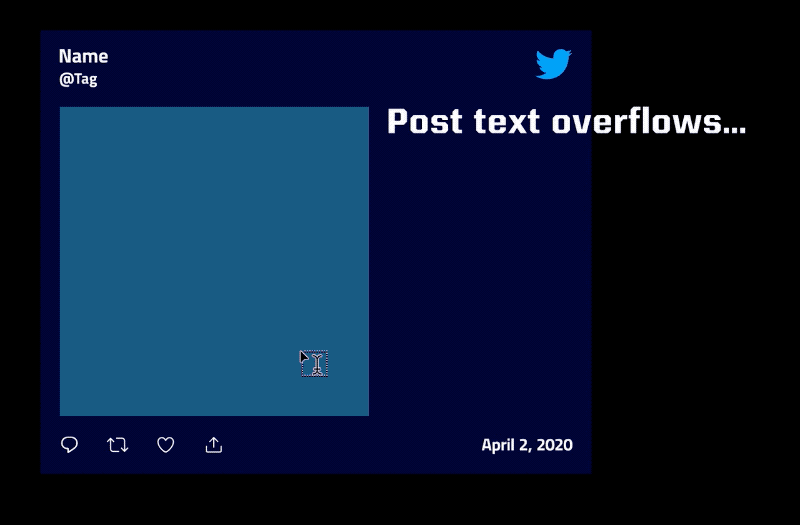
Limitation is, as of the current AE release (17.6), that the paragraph text box size cannot be controlled via expressions; therefore cannot be resized automatically. This becomes a problem when using the template in Premiere Pro, since we won't be able to change that box size, once set and exported from After Effects - the text will be left to either overflow or leave a gap, once the CONTAINER is resized. We therefore opted to set the text type to Point Text (as opposed to Paragraph Text), so we are not constrained by the paragraph text's box size - but we have to manually add line breaks to fit the text in the available space. If you are planning to use the rig in After Effects, or work with a predefined CONTAINER size, you may then want to change the text type to Paragraph Text instead - and adjust the paragraph box size manually.
Clamping values
Clamping is useful to set limits to the range of values available in our CONTROLS. We can use the clamp() method for this.
container_padding = clamp(thisComp.layer("CONTROLS").effect("Container Padding")("Slider"), 0, 100);
The arguments we specify in the parenthesis dictates the value to be clamped, followed by the range limit: clamp(value, min, max). Any value that falls above the max value will be clamped to the max value. Similarly, if a value falls below the min value, it will be clamped to the min value. A quick example is if we have min = 1 and max = 3 so that: clamp(value, 1, 3), if we then have a value of 3.5, that value would be clamped to 3. Alternatively, if we had a value of -4, that value would be clamped to 1.
Setting up the MOGRT template
A MOGRT template .mogrt, that stands for [MO]tion [GR]aphics [T]emplate, allows you to:
Encapsulate your After Effects project into a Motion Graphics template that can be edited directly in Premiere Pro. All the source images, videos, and pre-comps necessary to maintain your design are packaged in the template. Only the controls you expose are available for customization in Premiere Pro that allows you to retain creative control of your design.
In After Effects, you can start building MOGRT templates from the Essential Graphics panel in Window > Essential Graphics. In the open panel, you can choose the composition you want to target using the Primary dropdown menu. Once set, all you have to do is right click on a property in the timeline or Effects Controls panel, and choose Add Property to Essential Graphics.
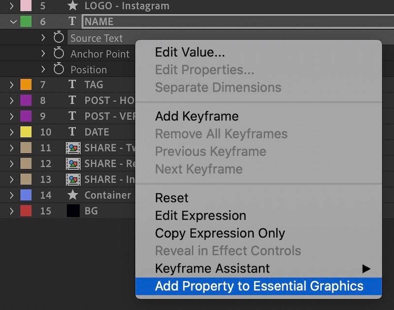
When you are done, you can hit the Export Motion Graphics Template at the bottom of the Essential Graphics panel. Now you can import your new template into Premiere Pro and test it in a sequence.
Note: For a more in-depth guide to MOGRT templates we suggest you read the official guide.
Conclusion
We hope you'll find this rig useful for your projects but, most importantly, that you've grasped the logic behind it - This will allow you to customize the rig or build new templates from scratch.
Additional Resources


 Dan 9 Aug 2020 • 19 min read
 Dan 5 Jan 2020 • 7 min read